Small Request: New Icon
Small Request: New Icon
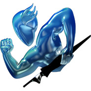
I love working with Nisus Writer. Ever since OS X arrived, I longed for an alternative word processor that could free me from having to use Word. I started working with Okito Composer, and followed it over to Nisus. My only request is a small one ... a new and re-designed application icon for the Dock.
Thank you,
Gerry
Thank you,
Gerry
talk about irony
are you talking the guy with the pen
 [/url]
that is whacked, I think the guy is righteous
this icon kicks the behind of all the other icons in my dock
 [/url]
that is whacked, I think the guy is righteous
this icon kicks the behind of all the other icons in my dock
I have never let my schooling interfere with my education/Mark Twain (1835-1910)
Re: talk about irony
Yup ... don't like the guy with the pen.
guy with pen rocks

are you put off by the blue manliness or the pen
like wouldyou want a red anorexic guy with a typewriter
maybe we should start a pole -- or a fondation
save the nisus man
and the blue guy could maybe use his pen as a harpoon :twisted:
I have never let my schooling interfere with my education/Mark Twain (1835-1910)
Re: guy with pen rocks
[quote="gemboy27"]
I reversed the icon a while back so the Nisus guy actually made a proper "N" instead of a backwards "N."

I reversed the icon a while back so the Nisus guy actually made a proper "N" instead of a backwards "N."
pen = ?
gemboy27 wrote: are you put off by the blue manliness or the pen
My inner Freudian wonders if one symbolizes the other.
I missed that. It would be interesting to see that »old» Okito typewriter. Where can I find it or have a look at it? Okito.org?gpercy wrote:I won't hold my breath for a new icon. I'd be happy using the Okito typewriter again. So Charles ... any chance someone could get their hands on a copy of the Okito .icns file?
Thanks,
Gerry
Peter Edwardsson
..............................
..............................
There's a snapshot of it on this review page:Peter Edwardsson wrote:I missed that. It would be interesting to see that »old» Okito typewriter. Where can I find it or have a look at it? Okito.org?
http://brianboos.com/reviews/okitocomposer04d2/
No offense Charles, but I prefer the present icon of the guy with the pen, instead of the old Okito typewriter.gpercy wrote:There's a snapshot of it on this review page:Peter Edwardsson wrote:I missed that. It would be interesting to see that »old» Okito typewriter. Where can I find it or have a look at it? Okito.org?
http://brianboos.com/reviews/okitocomposer04d2/
Peter Edwardsson
..............................
..............................
Yeah, I guess my memory of it got better with the passing of time, but now that I've seen it again I'll pass as well (No offense Charles 2). By today's standards the Okito typewriter has too much detail in it to be effective and aesthetically pleasing in the dock, IMHO.Peter Edwardsson wrote:No offense Charles, but I prefer the present icon of the guy with the pen, instead of the old Okito typewriter.
Coincidentally, I just came across an application icon this morning ... a classic circular typewriter key. Its a great example of what I had in mind when I started this topic ... an icon that is designed to look good in the dock and communicate the function of the application well. As it is, I've borrowed this icon and replaced the guy with the pen. Looks great!
I feel that some application icons work well on the splash screen when the app launches, but that same image suffers in the dock because of the smaller size. I feel that the NWE icon is an example of this.
I am curious who this guy is though? ... perhaps Mercury, the mythological Roman fleet-footed messenger of the gods? Carrying a calligraphy pen?
Last edited by gpercy on 2005-01-25 14:23:15, edited 1 time in total.
-
rmark
- Official Nisus Person
- Posts: 428
- Joined: 2003-02-11 10:49:05
- Location: Solana Beach, CA
- Contact:
Ah, the (venerable) Nisus Man icon....
I'll look into putting up the earlier versions of the graphics as well.
You can learn more in the Nisus Writer Classic FAQ Who is that [masked] man?gpercy wrote:I am curious who this guy is though? ... perhaps Mercury, the mythological Roman fleet-footed messenger of the gods? Carrying a calligraphy pen?
I'll look into putting up the earlier versions of the graphics as well.
Write On!
Mark Hurvitz
Nisus Software Inc.
Mark Hurvitz
Nisus Software Inc.