Page 1 of 1
The way underlining appears
Posted: 2011-08-08 04:29:11
by NisusUser
This is probably a very newbie question, but I've noticed that no matter what Latin-based font I use, NWP (1.4.1 at this point) underlines in such a way that the underline's line does not cut through the portions of letters below the baseline. Can anything be done to change that? I would prefer a thinner underline and one that doesn't do that. Thanks!
Re: The way underlining appears
Posted: 2011-08-08 12:01:45
by martin
I think you're referring to the way the underline does not draw "on top" of the descenders (eg: the bottom curve of a "g")

- under.png (11.93 KiB) Viewed 8365 times
If so, that's a feature, and one we inherit from the Apple text engine that NWP uses. If you don't like the effect, I'm sorry but there's no option in NWP to change it.
Re: The way underlining appears
Posted: 2011-08-08 18:28:57
by NisusUser
Thank you, Martin, for your reply. I had a hunch that was the way it is. I think the reason that feature doesn't set well with me is that the underline itself seems so bold -– disproportionately thick. Is there anything I can do to thin it down?
Re: The way underlining appears
Posted: 2011-08-08 22:54:13
by feat
Professional typographers never use underlining: it's ugly and it sucks, how ever you tweak it... did you ever see a real book with underlines in it?
Originally, it's the poor man's typewriter substitute for italics: on modern computers, you don't need this!
Re: The way underlining appears
Posted: 2011-08-09 04:49:25
by NisusUser
Well, in general I agree with your position, but I wasn't thinking of a book.

But I think I have seen some serious books with underlining in them, though very, very few indeed. In any case, it'd be nice if there were a nicer way to do something some think no professional typographer would "ever" do
Nonetheless, your comment is well taken.
Re: The way underlining appears
Posted: 2011-08-09 08:40:23
by martin
If you want to use underlines in your document, don't worry, Nisus Writer won't judge you

But there aren't any options to control the underline thickness/etc. How the underline draws is up to Apple, which seems to somehow take the font into account. And it doesn't seem to be something generic, like the letter size or stroke width:
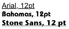
- underlines.png (13.71 KiB) Viewed 8321 times
So I'm not sure how the thickness is calculated or derived. Maybe there are instructions/hints in the font file itself.
Re: The way underlining appears
Posted: 2011-08-09 13:57:51
by Elbrecht
Hi -
Underline is font related - see attached font metrics from Fontographer.
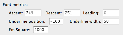
But no typographer cares - not one designing a font and not one applying a font - because the Mac is no typewriter. Besides Mellel…
HE
Re: The way underlining appears
Posted: 2011-08-09 14:30:41
by martin
Thanks for the information Elbrecht- that's interesting to know all the same.